Your best ally for easily building responsive web applications:
Build your interface in one single resolution, and let the package take care of the rest, scaling your sizes, paddings, margins, font-sizes, and more for all desktop resolutions
It works with a single line of execution, and has great synergy with any library or framework that uses the rem unit
ui-scaler will make sure your app proportions and relative sizes are the same across all desktop resolutions. The effect is most recognized in higher screen resolutions:
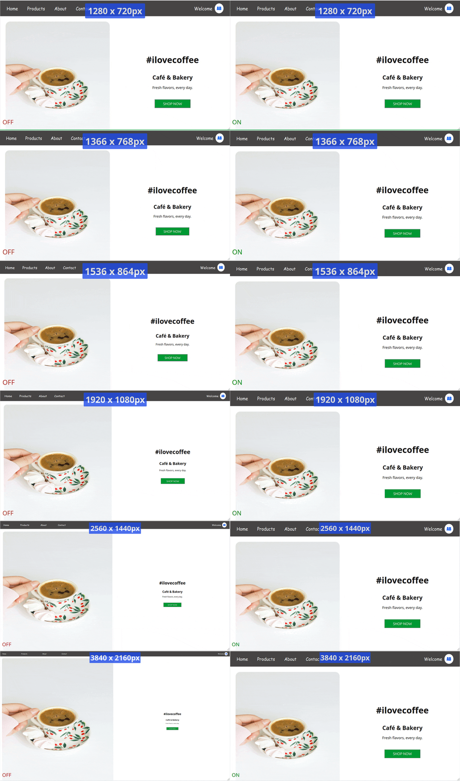
You will also notice an easier experience when adjusting the UI for portrait or mobile resolutions, since all elements proportions will look good, leaving to you just the effort of repositioning and realigning the elements
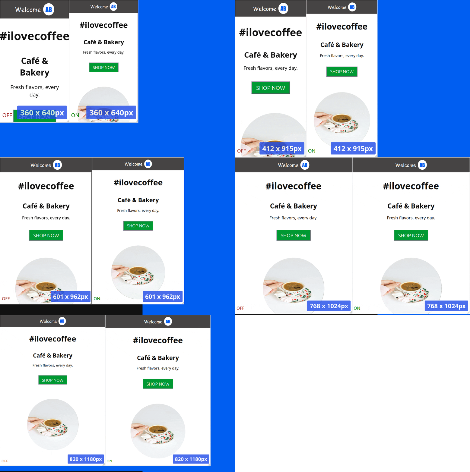
You don’t need to waste time checking or adjusting your interface across different desktop screen resolutions — it will look virtually the same on all of them.
There are two usage methods:
npm i ui-scaler
Then in your app entry point:
// main.js|ts
import scaleUI from 'ui-scaler'

...

// last line
scaleUI()Add to your index.html:
<head>
  <script src="https://cdn.jsdelivr.net/npm/ui-scaler@2.3.0/dist/browser-bundle.min.js"></script>
</head>A script will be added to your app, which:
- Has 3kb
- Runs once the document is ready
- Adds a window resize event listener that updates the HTML element font-size, based on the screen resolution, and the browser font-size
- Optionally, adds styles transformation logic that convert pixel values to rem values (see how to activate below)
Notice your app HTML font-size to be different in each screen resolution
All properties with rem values will respond, and adjust accordingly
Font-size styles take in consideration the user browser font-size definition, so we have a web accessible compliant solution
scaleUI receives a single, optional options object. All fields are optional and fall back to their default values.
type UiScalerOptions = {
  transformPixels?: 'runtime' | TransformPixelsOptions | boolean, // default: false
  baseFontSize?: number, // default: 16
  enableLandscapeScaling?: boolean, // default: true
  enablePortraitScaling?: boolean // default: true
}The transformPixels field instructs the script to convert styles pixel values to rem:
The script will try to convert all document pixel styles to the respective rem definition
// main.ts
import scaleUI from 'ui-scaler'

...

scaleUI({ transformPixels: true })You can exclude given attributes and/or selectors from this transformation, by passing an object.
In below example, border-radius styles and elements with #myCustomId id will keep their styles in pixels.
// main.ts
import scaleUI from 'ui-scaler'

...

scaleUI({
  transformPixels: {
    excludeAttributes: ['border-radius'],
    excludeSelectors: ['#myCustomId']
  }
})When using the TransformPixelsOptions argument, you can also add a ignore-ui-scaler class to any HTML element so the script transformations do not affect it. Example:
<style>
.width-300 {
  width: 300px;
}
/* Auto-generated class definition - done by the transformation script */
.width-300:not(.ignore-ui-scaler) {
  width: 18.75rem;
}
</style>

<div class="width-300 ignore-ui-scaler">
  My width will remain in pixels!
</div>The baseFontSize field adjusts the base font size used in the script math.
This is useful if your elements are looking either too big or too small after applying the package.
The default value is 16, so if your elements are looking too big, try using 14 or 12. In case they are too small, try using larger values such as 18 or 20. Fine adjust this value until you get your perfect UI.
Example:
import scaleUI from 'ui-scaler'

...

scaleUI({ baseFontSize: 14 })The enableLandscapeScaling and enablePortraitScaling fields let you turn the HTML font-size scaling on or off for a given screen orientation. Both default to true.
When a field is set to false, the script will not apply its font-size scaling logic while the screen is in that orientation, and the browser default font-size will be used instead.
This is useful, for example, if you only want ui-scaler to handle desktop/landscape resolutions, while leaving portrait/mobile layouts to your own responsive styles (like % or media queries).
Example - disable scaling on portrait resolutions only:
import scaleUI from 'ui-scaler'

...

scaleUI({ enablePortraitScaling: false })In case you are using the <script src="..."></script> installation method, and you want to pass any customization options to the script, add a single data-ui-scaler-options attribute to your html element, containing a stringified JSON object with any of the UiScalerOptions fields (see Parameters above).
<html data-ui-scaler-options='{ "baseFontSize": 20 }'>
...
</html>
or
<html data-ui-scaler-options='{ "transformPixels": { "excludeAttributes": ["border-radius"] } }'>
...
</html>
or, combining multiple options:
<html data-ui-scaler-options='{ "transformPixels": true, "baseFontSize": 20, "enablePortraitScaling": false }'>
...
</html>
Note: when transforming pixels via the <script src="..."></script> method, pixel transformation defaults to true unless you explicitly set "transformPixels": false in the data-ui-scaler-options attribute.