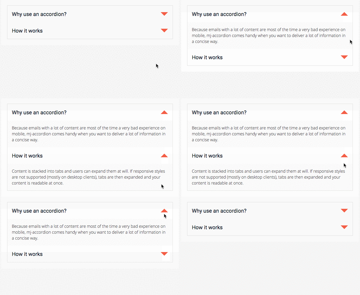
An interactive MJML component that stacks content in tabs, so the information is collapsed and only the titles are visible.
Readers can interact by clicking on the tabs to reveal the content, providing a better experience for mobile users by reducing the amount of scrolling.
Note
mj-accordion-text and mj-accordion-title are "ending tags", which means that they can contain HTML code but they cannot contain other MJML components.
More information about ending tags in this section.
<mjml>
  <mj-head>
    <mj-attributes>
      <mj-accordion border="none" padding="1px" />
      <mj-accordion-element icon-wrapped-url="https://static.mailjet.com/mjml-website/documentation/accordion-arrow-down.png" icon-unwrapped-url="https://static.mailjet.com/mjml-website/documentation/accordion-arrow-up.png" icon-height="24px" icon-width="24px" />
      <mj-accordion-title font-family="Roboto, Open Sans, Helvetica, Arial, sans-serif" background-color="#fff" color="#031017" padding="15px" font-size="18px" />
      <mj-accordion-text font-family="Open Sans, Helvetica, Arial, sans-serif" background-color="#fafafa" padding="15px" color="#505050" font-size="14px" />
    </mj-attributes>
  </mj-head>

  <mj-body>
    <mj-section padding="20px" background-color="#ffffff">
      <mj-column background-color="#dededd">
        <mj-accordion>
          <mj-accordion-element>
            <mj-accordion-title>Why use an accordion?</mj-accordion-title>
            <mj-accordion-text>
              <span style="line-height:20px">
                Because emails with a lot of content are most of the time a very bad experience on mobile, mj-accordion comes handy when you want to deliver a lot of information in a concise way.
              </span>
            </mj-accordion-text>
          </mj-accordion-element>
          <mj-accordion-element>
            <mj-accordion-title>How it works</mj-accordion-title>
            <mj-accordion-text>
              <span style="line-height:20px">
                Content is stacked into tabs and users can expand them at will. If responsive styles are not supported (mostly on desktop clients), tabs are then expanded and your content is readable at once.
              </span>
            </mj-accordion-text>
          </mj-accordion-element>
        </mj-accordion>
      </mj-column>
    </mj-section>
  </mj-body>
</mjml>| attribute | accepts | description | default value |
|---|---|---|---|
| border | string | CSS border format | 2px solid black |
| container-background-color | CSS color formats | background-color of the cell | |
| css-class | string | class name, added to the root HTML element created | |
| font-family | string | font | Ubuntu, sans-serif |
| icon-align | top middle bottom |
icon alignment | |
| icon-height | px % |
icon height | 32px |
| icon-position | left right |
display icon left or right | right |
| icon-unwrapped-alt | string | alt text when accordion is unwrapped | - |
| icon-unwrapped-url | string | icon when accordion is unwrapped | https://i.imgur.com/w4uTygT.png |
| icon-width | px % |
icon width | 32px |
| icon-wrapped-alt | string | alt text when accordion is wrapped | + |
| icon-wrapped-url | string | icon when accordion is wrapped | https://i.imgur.com/bIXv1bk.png |
| padding | px % |
accordion padding, supports up to 4 parameters | 10px 25px |
| padding-bottom | px % |
accordion bottom padding | |
| padding-left | px % |
accordion left padding | |
| padding-right | px % |
accordion right padding | |
| padding-top | px % |
accordion top padding |
| attribute | accepts | description | default value |
|---|---|---|---|
| icon-unwrapped-url--dark | string | dark-mode icon when accordion is unwrapped | |
| icon-wrapped-url--dark | string | dark-mode icon when accordion is wrapped |
Note
All --dark modifier attributes require support-dark-mode="true" to be set on the <mjml> tag to work effectively in all supported clients.
| attribute | accepts | description | default value |
|---|---|---|---|
| icon-height--responsive | px % |
icon height | |
| icon-width--responsive | px % |
icon width | |
| padding--responsive | px % |
accordion padding, supports up to 4 parameters | |
| padding-bottom--responsive | px % |
accordion bottom padding | |
| padding-left--responsive | px % |
accordion left padding | |
| padding-right--responsive | px % |
accordion right padding | |
| padding-top--responsive | px % |
accordion top padding |
Creates an accordion title/text pair. An accordion can have any number of these pairs.
Note
Inheritance applies for attributes supported in both mj-accordion and
mj-accordion-element except where the latter overrides.
| attribute | accepts | description | default value |
|---|---|---|---|
| aria-label | string | adds an aria-label attribute to the slide container |
|
| aria-roledescription | string | adds an aria-roledescription attribute to the slide container |
|
| background-color | CSS color formats | background color | |
| border | string | CSS border format. affects each horizontal border in the accordion except the top one |
|
| css-class | string | class name, added to the root HTML element created | |
| font-family | string | font | |
| icon-align | top middle bottom |
icon alignment | |
| icon-height | px % |
icon width | 32px |
| icon-position | left right |
postion of icon | |
| icon-unwrapped-alt | string | alt text when accordion is unwrapped | |
| icon-unwrapped-url | string | icon when accordion is unwrapped | |
| icon-width | px % |
icon height | 32px |
| icon-wrapped-alt | string | alt text when accordion is wrapped | |
| icon-wrapped-url | string | icon when accordion is wrapped | |
| role | string | adds a role attribute to the slide container |
| attribute | accepts | description | default value |
|---|---|---|---|
| background-color--dark | CSS color formats | background color in dark mode | |
| border-color--dark | CSS color formats | border color in dark mode | |
| icon-unwrapped-url--dark | string | dark-mode icon when accordion is unwrapped | |
| icon-wrapped-url--dark | string | dark-mode icon when accordion is wrapped |
Note
All --dark modifier attributes require support-dark-mode="true" to be set on the <mjml> tag to work effectively in all supported clients.
| attribute | accepts | description | default value |
|---|---|---|---|
| icon-height--responsive | px % |
icon width | |
| icon-width--responsive | px % |
icon height |
Displays the title in a title/text pair.
| attribute | accepts | description | default value |
|---|---|---|---|
| background-color | CSS color formats | background color | |
| color | CSS color formats | text color | |
| css-class | string | class name, added to the root HTML element created | |
| font-family | string | font family | |
| font-size | px rem |
font size | 16px |
| font-weight | string | text thickness | |
| padding | px % |
accordion title padding, supports up to 4 parameters | 16px |
| padding-bottom | px % |
accordion title bottom padding | |
| padding-left | px % |
accordion title left padding | |
| padding-right | px % |
accordion title right padding | |
| padding-top | px % |
accordion title top padding |
| attribute | accepts | description | default value |
|---|---|---|---|
| background-color--dark | CSS color formats | background color in dark mode | |
| color--dark | CSS color formats | text color in dark mode | |
| icon-unwrapped-url--dark | string | dark-mode icon when accordion is unwrapped | |
| icon-wrapped-url--dark | string | dark-mode icon when accordion is wrapped |
Note
All --dark modifier attributes require support-dark-mode="true" to be set on the <mjml> tag to work effectively in all supported clients.
| attribute | accepts | description | default value |
|---|---|---|---|
| font-size--responsive | px rem |
font size | |
| padding--responsive | px % |
accordion title padding, supports up to 4 parameters | |
| padding-bottom--responsive | px % |
accordion title bottom padding | |
| padding-left--responsive | px % |
accordion title left padding | |
| padding-right--responsive | px % |
accordion title right padding | |
| padding-top--responsive | px % |
accordion title top padding |
Displays the text in a title/text pair.
| attribute | accepts | description | default value |
|---|---|---|---|
| background-color | CSS color formats | background color | |
| color | CSS color formats | text color | |
| css-class | string | class name, added to the root HTML element created | |
| font-family | string | font family | |
| font-size | px rem |
font size | 16px |
| font-weight | string | text thickness | |
| letter-spacing | px em |
letter spacing | |
| line-height | px % em rem |
space between the lines | 150% |
| padding | px % |
accordion text padding, supports up to 4 parameters | 16px |
| padding-bottom | px % |
accordion text bottom padding | |
| padding-left | px % |
accordion text left padding | |
| padding-right | px % |
accordion text right padding | |
| padding-top | px % |
accordion text top padding | |
| role | string | adds a role attribute to the slide container |
region |
| attribute | accepts | description | default value |
|---|---|---|---|
| background-color--dark | CSS color formats | background color in dark mode | |
| color--dark | CSS color formats | text color in dark mode |
Note
All --dark modifier attributes require support-dark-mode="true" to be set on the <mjml> tag to work effectively in all supported clients.
| attribute | accepts | description | default value |
|---|---|---|---|
| font-size--responsive | px rem |
font size | |
| line-height--responsive | px % em rem |
space between the lines | |
| padding--responsive | px % |
accordion text padding, supports up to 4 parameters | |
| padding-bottom--responsive | px % |
accordion text bottom padding | |
| padding-left--responsive | px % |
accordion text left padding | |
| padding-right--responsive | px % |
accordion text right padding | |
| padding-top--responsive | px % |
accordion text top padding |