A Flutter widget that renders a realistic, customizable credit-card UI with optional flip animation, balance display, and provider-logo support.






- Features
- What it is / What it isn't
- Installation
- Quick start
- Recipes
- Programmatic flipping API
- Parameters reference
- Migration notes
- Compatibility
- Contributing
- License
- Realistic card UI with chip, NFC indicator, gradient background, and OCR-A font for card numbers.
- Automatic network detection for Visa, Mastercard, American Express, and Discover from the card number; can also be set explicitly or hidden.
- Card types — credit, debit, prepaid, gift card, or none.
- Flippable card — horizontal drag gesture flips between front and CVV-bearing back side; optional programmatic control via
CreditCardController. - Balance display with optional "tap to reveal" mode (auto-hides after 2 seconds).
- Customizable gradient colors, provider logo (any
Widget), provider logo position, background image, card width, and card-number masking. - No third-party dependencies at runtime.
| It is | It isn't |
|---|---|
| A presentation-layer widget for displaying card details | A card-number or CVV validator |
| Useful for wallets, dashboards, fintech mockups | A payment-processing or tokenization library |
| Pure Dart + Flutter, no platform channels | A PCI-compliant input form |
If you need card-input form fields or Luhn validation as part of a payment flow, pair this widget with a dedicated forms or payments package.
Add the dependency to your pubspec.yaml:
dependencies:
  u_credit_card: ^1.6.0
Then fetch it:
flutter pub getImport it where you need it:
import 'package:u_credit_card/u_credit_card.dart';The widget needs three values: cardholder name, card number, and the "Valid Thru" date.
CreditCardUi(
  cardHolderFullName: 'John Doe',
  cardNumber: '1234567812345678',
  validThru: '10/24',
)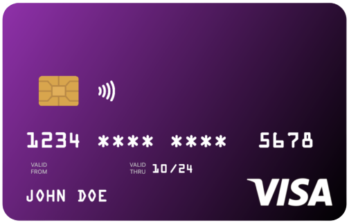
By default, the card is purple, shows the NFC icon next to the chip, and masks the middle digits of the card number.
Each recipe builds on the quick-start example and shows only the parameters that change.
Set topLeftColor and bottomRightColor to control the gradient. If you omit bottomRightColor, a darker shade of topLeftColor is used automatically.
CreditCardUi(
  cardHolderFullName: 'John Doe',
  cardNumber: '1234567812345678',
  validThru: '10/24',
  topLeftColor: Colors.red,
  bottomRightColor: Colors.purpleAccent,
)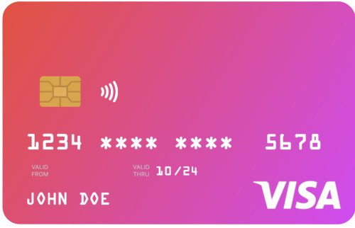
Because card text is rendered in white, avoid light gradient colors.
Use the width parameter rather than wrapping the widget in a SizedBox. The card is laid out at its natural width of 300 logical pixels and scales proportionally to fit width. Values above 300 are clamped.
CreditCardUi(
  width: 240,
  cardHolderFullName: 'John Doe',
  cardNumber: '1234567812345678',
  validThru: '10/24',
)cardType controls the small label at the top of the card (CREDIT, DEBIT, PREPAID, GIFT CARD); pass CardType.other to hide the label.
creditCardType controls the network logo (Visa, Mastercard, Amex, Discover). If omitted, the widget auto-detects the network from cardNumber. Pass CreditCardType.none to hide the logo entirely.
CreditCardUi(
  cardHolderFullName: 'John Doe',
  cardNumber: '4111111111111111',  // detected as Visa
  validThru: '10/24',
  cardType: CardType.debit,
  // creditCardType: CreditCardType.mastercard, // optional override
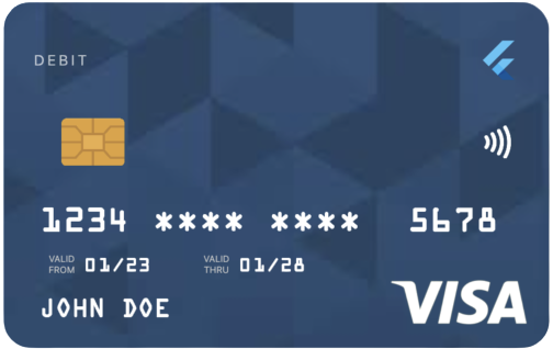
)cardProviderLogo accepts any widget — typically your bank or wallet logo. Position it on the left or right of the card-type label with cardProviderLogoPosition. Add a background image with backgroundDecorationImage; both NetworkImage and AssetImage are supported.
CreditCardUi(
  cardHolderFullName: 'John Doe',
  cardNumber: '1234567812345678',
  validThru: '10/24',
  cardProviderLogo: const FlutterLogo(),
  cardProviderLogoPosition: CardProviderLogoPosition.right,
  backgroundDecorationImage: const DecorationImage(
    fit: BoxFit.cover,
    image: NetworkImage('https://example.com/card-bg.png'),
  ),
)
Set showBalance: true and pass a balance to render the amount in the top-left of the card. Enabling autoHideBalance: true replaces the figure with a "TAP TO SEE BALANCE" placeholder; tapping reveals it for two seconds. currencySymbol defaults to $.
CreditCardUi(
  cardHolderFullName: 'John Doe',
  cardNumber: '1234567812345678',
  validThru: '10/24',
  showBalance: true,
  balance: 128.32,
  autoHideBalance: true,
  currencySymbol: '€',
)Set enableFlipping: true to render a back side (with the CVV) and enable a horizontal-drag gesture that flips between sides. Provide the CVV with cvvNumber.
CreditCardUi(
  cardHolderFullName: 'John Doe',
  cardNumber: '1234567812345678',
  validThru: '10/24',
  enableFlipping: true,
  cvvNumber: '123',
)
Haptic feedback fires on each flip; disable it with disableHapticFeedBack: true.
For flows that need to flip the card in response to UI events — for example, flipping to the back when a CVV input field gains focus — attach a CreditCardController.
class CheckoutCard extends StatefulWidget {
  const CheckoutCard({super.key});

  @override
  State<CheckoutCard> createState() => _CheckoutCardState();
}

class _CheckoutCardState extends State<CheckoutCard> {
  final _cardController = CreditCardController();
  final _cvvFocusNode = FocusNode();

  @override
  void initState() {
    super.initState();
    _cvvFocusNode.addListener(() {
      if (_cvvFocusNode.hasFocus) {
        _cardController.flipToBack();
      } else {
        _cardController.flipToFront();
      }
    });
  }

  @override
  void dispose() {
    _cardController.dispose();
    _cvvFocusNode.dispose();
    super.dispose();
  }

  @override
  Widget build(BuildContext context) {
    return Column(
      children: [
        CreditCardUi(
          controller: _cardController,
          enableFlipping: true,
          cardHolderFullName: 'John Doe',
          cardNumber: '1234567812345678',
          validThru: '10/24',
          cvvNumber: '123',
        ),
        TextField(
          focusNode: _cvvFocusNode,
          decoration: const InputDecoration(labelText: 'CVV'),
        ),
        ElevatedButton(
          onPressed: _cardController.flipCard,
          child: const Text('Flip'),
        ),
      ],
    );
  }
}
CreditCardController exposes:
| Member | Description |
|---|---|
flipCard() |
Toggles between front and back. |
flipToFront() |
Flips to the front; no-op if already on the front. |
flipToBack() |
Flips to the back; no-op if already on the back. |
isFlipped |
Getter — true when the back side is showing. |
CreditCardController extends ChangeNotifier, so you can addListener to react to flip state changes. Call dispose() from your widget's dispose method.
The controller has no effect when enableFlipping: false. Pair the two parameters together.
Listed alphabetically. Defaults reflect the constructor; null means "not provided".
| Name | Type | Default | Description |
|---|---|---|---|
autoHideBalance |
bool? |
false |
Shows a "TAP TO SEE BALANCE" placeholder; tapping reveals the balance for 2 seconds. |
backgroundDecorationImage |
DecorationImage? |
null |
Image painted under the gradient. Supports NetworkImage and AssetImage. |
balance |
double? |
0.0 |
Balance displayed when showBalance is true. |
bottomRightColor |
Color? |
derived | Bottom-right gradient stop. Defaults to a darker shade of topLeftColor. |
cardHolderFullName |
String |
required | Rendered uppercased on the front of the card. |
cardNumber |
String |
required | The card number. Spaces, dashes, and asterisks are normalized before display. |
cardProviderLogo |
Widget? |
null |
Any widget — typically a bank or brand logo. |
cardProviderLogoPosition |
CardProviderLogoPosition |
.right |
Position of cardProviderLogo relative to the card-type label. |
cardType |
CardType |
.credit |
Drives the small label at the top of the card. CardType.other hides the label. |
controller |
CreditCardController? |
null |
Drives programmatic flipping. Requires enableFlipping: true. |
creditCardType |
CreditCardType? |
null |
Overrides the auto-detected network logo. Pass .none to hide it. |
currencySymbol |
String? |
'$' |
Prefix shown before the balance. |
cvvNumber |
String? |
'***' |
Shown on the back of the card when flipped. |
disableHapticFeedBack |
bool? |
false |
Disables haptic feedback on flip and balance tap. (Note: the capital "B" reflects the existing public API.) |
doesSupportNfc |
bool |
true |
Shows the NFC icon next to the chip. |
enableFlipping |
bool? |
false |
Renders the back side and enables the drag-to-flip gesture. Required for controller to take effect. |
placeNfcIconAtTheEnd |
bool |
false |
Moves the NFC icon to the opposite side of the chip. Has no effect when doesSupportNfc: false. |
scale |
double |
1.0 |
Deprecated — use width instead. Will be removed in a future minor release. |
shouldMaskCardNumber |
bool |
true |
Masks the middle digits with *. Card numbers under 12 digits are never masked. |
showBalance |
bool? |
false |
Shows the balance area in place of the card-type label. |
showValidFrom |
bool |
true |
Shows the "VALID FROM" segment when validFrom is provided. |
showValidThru |
bool |
true |
Shows the "VALID THRU" segment. |
topLeftColor |
Color |
Colors.purple |
Top-left gradient stop. |
validFrom |
String? |
null |
Optional "MM/YY" start date. |
validThru |
String |
required | "MM/YY" expiration date. |
width |
double? |
null |
Maximum width in logical pixels. Capped at 300; smaller values scale the card proportionally. |
Full API documentation is available on pub.dev.
scale→width(since 1.3.0).scale: 0.8is equivalent towidth: 240. Thescaleparameter will be removed in a future minor release.disableShowingCardLogoremoved (since 1.1.0). UsecreditCardType: CreditCardType.noneinstead.CreditCardControlleradded in 1.6.0 for programmatic flipping. Existing widgets using only the drag gesture need no changes.
- Flutter: 3.x (uses APIs available from Flutter 3.16+, e.g.
Durations). - Dart:
>=3.3.0 <4.0.0. - Platforms: any platform Flutter supports — no platform channels involved.
Bug reports, feature requests, and pull requests are welcome. See CONTRIBUTING.md and the Code of Conduct.
For security-sensitive reports, follow the guidance in SECURITY.md.
Released under the BSD 3-Clause License.

Utpal Barman
Built with ♥ in Bangladesh — ধন্যবাদ
